If your ads, LinkedIn, and website look like three different companies, you’re paying a tax on every impression.
You don’t need a 60-page brand book. You need a brand identity system people can actually use. Here’s the simple version we recommend before you scale spend.
What is brand identity (in practical terms)?
Brand identity is the visual and verbal system that makes you recognisable: logo treatment, colours, type, and a few layout rules. It’s not vibes. It’s consistency.
Why identity before ads (and outreach)
Paid traffic and cold outreach hit cold audiences. If they meet three different looks, trust drops. Consistency compounds recognition—and recognition makes replies easier.
- Same logo rules across web and social
- Same colour system in ads and landing pages
- Same type pairing in decks and posts
- Same tone so outreach matches the site
The minimum brand kit that actually gets used
If your team can’t apply it in 10 minutes, it’s too complex.
Want logo, colour, type, and guidelines handled as one package? See our branding service.
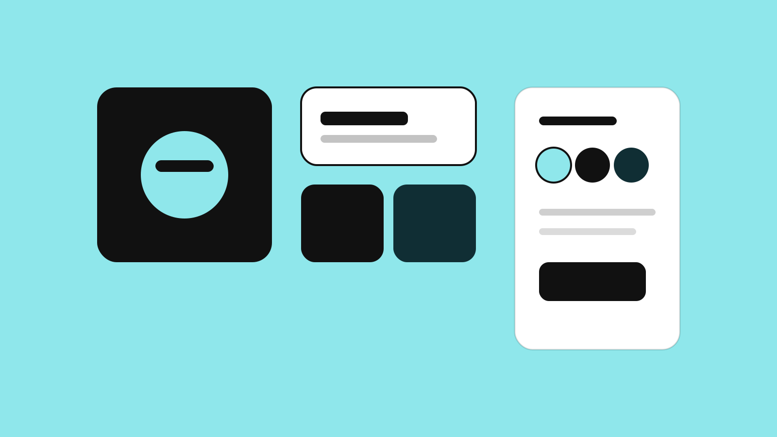
- Logo (primary + clear-space rules)
- Colour system (primary, secondary, neutrals)
- Type pairing (heading + body)
- 2–3 example layouts (web hero, LinkedIn post, email header)