Here’s the uncomfortable truth: more traffic won’t save a confusing website. If visitors can’t tell what you do, who it’s for, and what happens next, they leave.
In this guide, I’ll break down the 6 website sections we use to turn more visitors into enquiries. You can audit your current site against this checklist today.
What makes a website convert?
A converting website is not “pretty.” It’s clear. Visitors should understand the offer in seconds, trust it with proof, and see one obvious next step.
The 6 sections that actually move enquiries
- Outcome-led hero (result + who it’s for + one CTA)
- Proof strip (logos, results, reviews near the decision)
- Offer clarity (what’s included / who it’s for)
- Process (how working with you feels)
- Objection handling (FAQs that remove friction)
- Final CTA (one path: book, quote, or buy)
Section 1: lead with the outcome in your hero
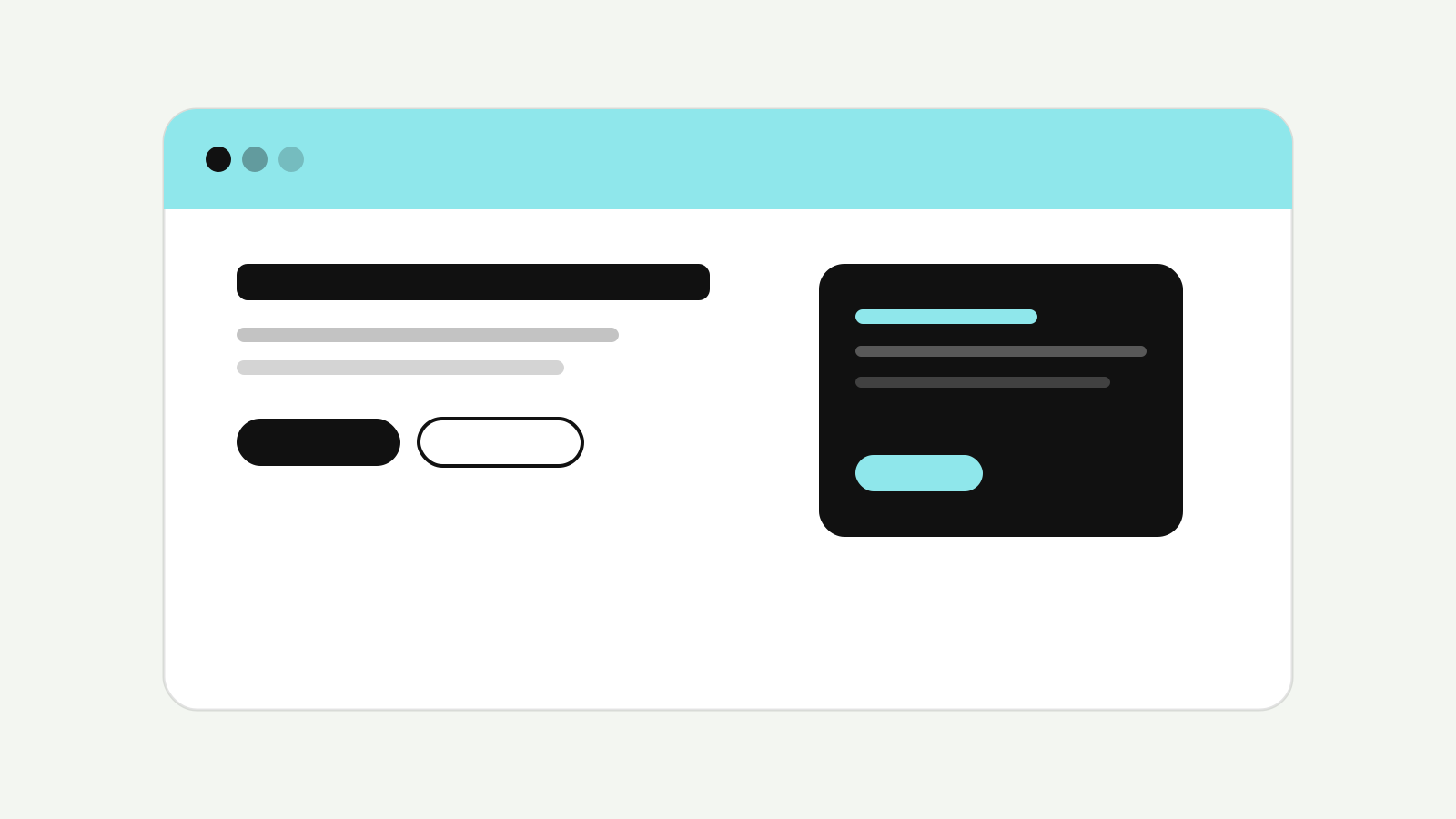
Your hero should state the result you create—not a list of services. Support it with one short sentence and one primary CTA.
Section 2–3: put proof where doubt appears
Case results, logos, and reviews belong near pricing and CTAs. That’s where hesitation spikes. Proof in the footer doesn’t save a confused hero.
Make the next step painfully obvious
One main action per section beats a page full of competing buttons. Book a call, request a quote, or start a package—pick the primary path and design around it.
Need a site built for enquiries? See our web design service.